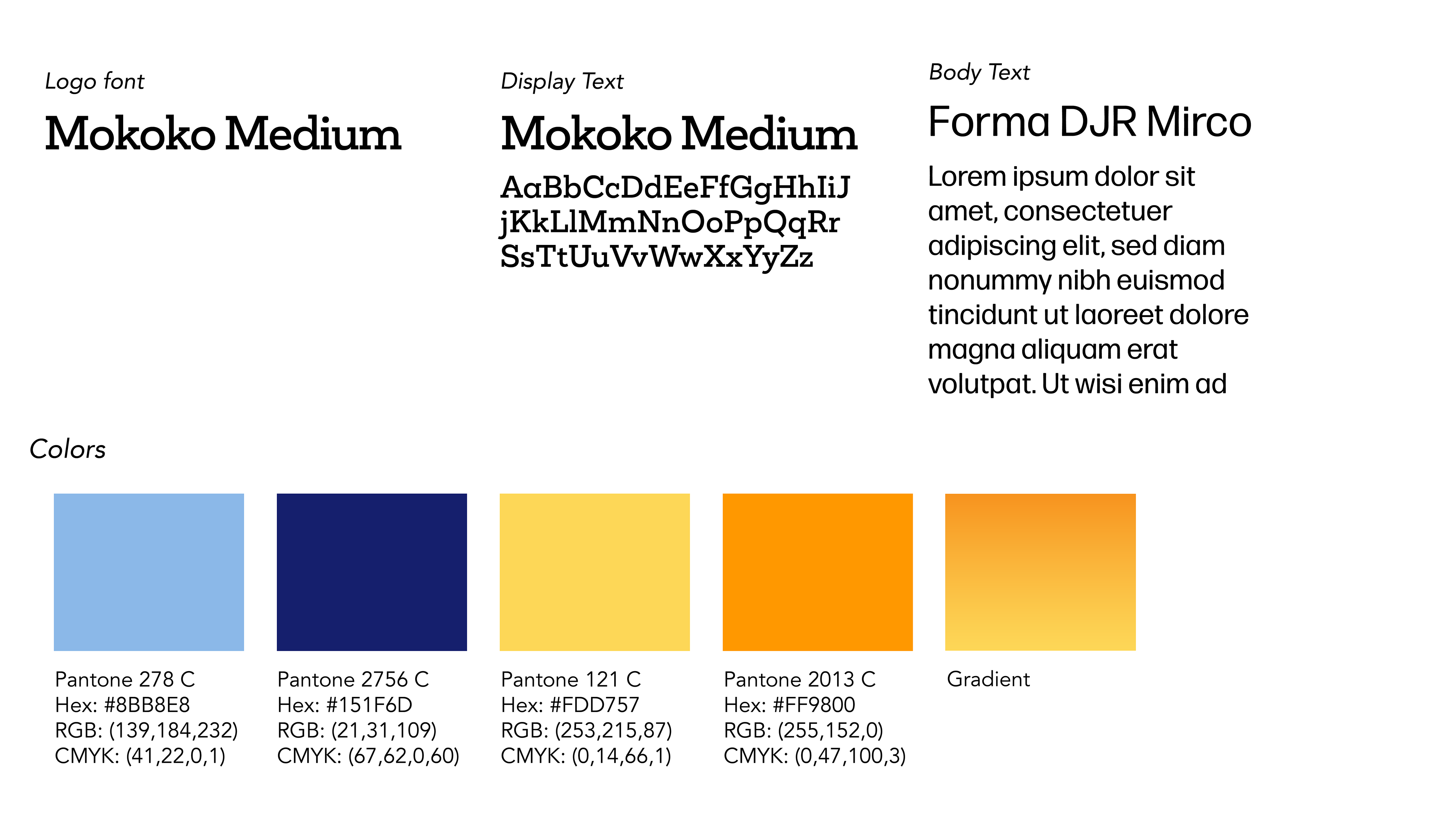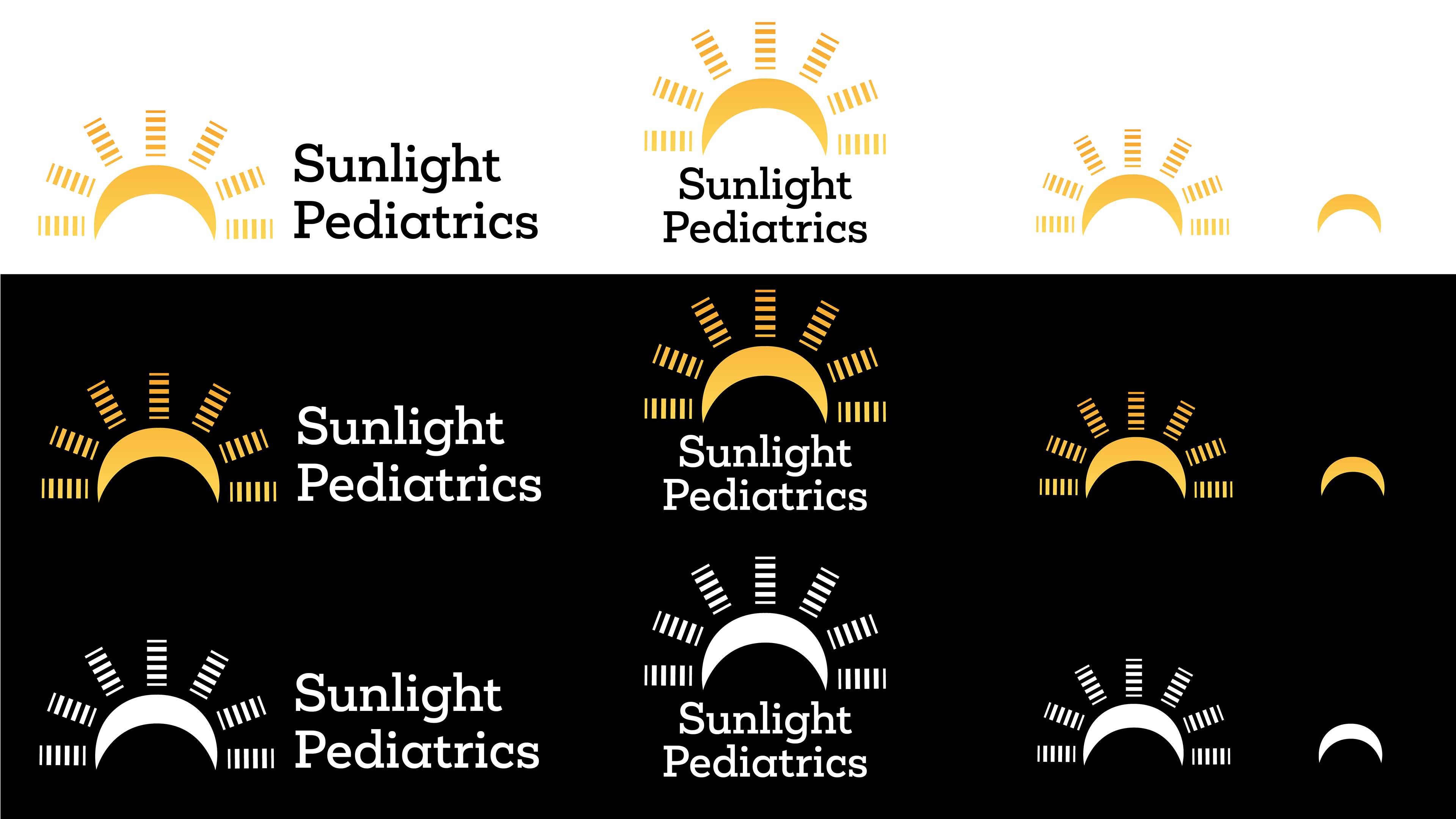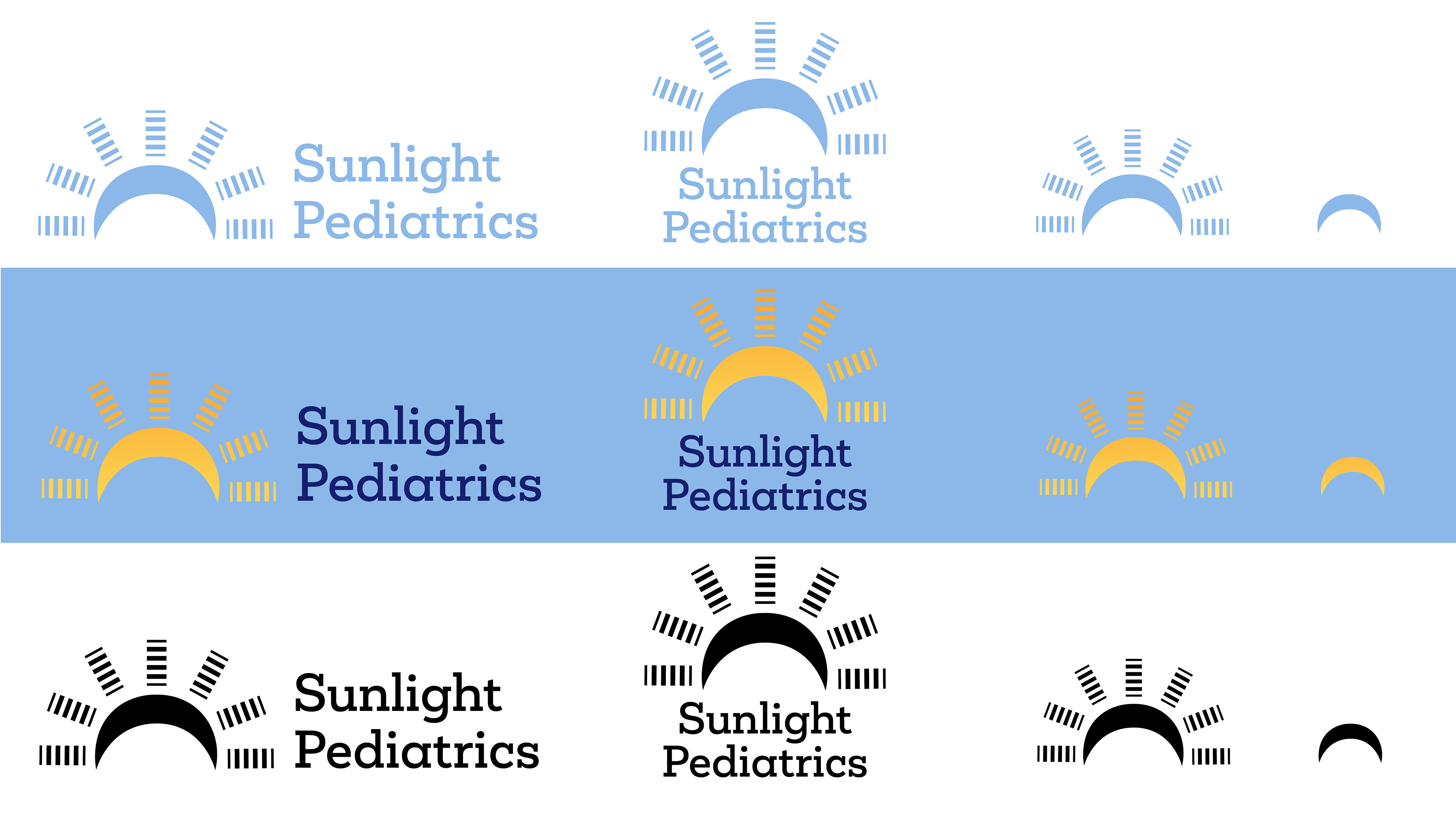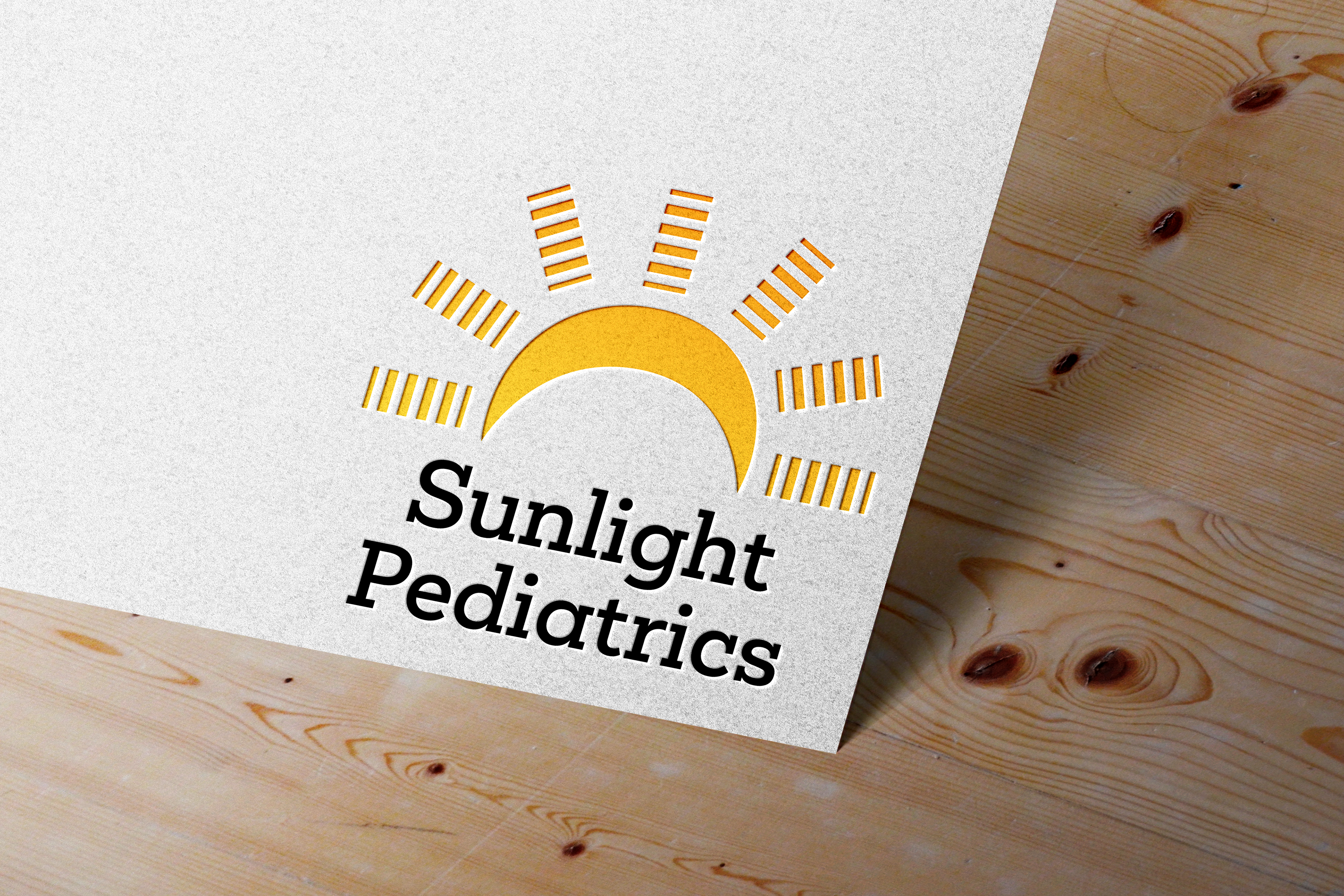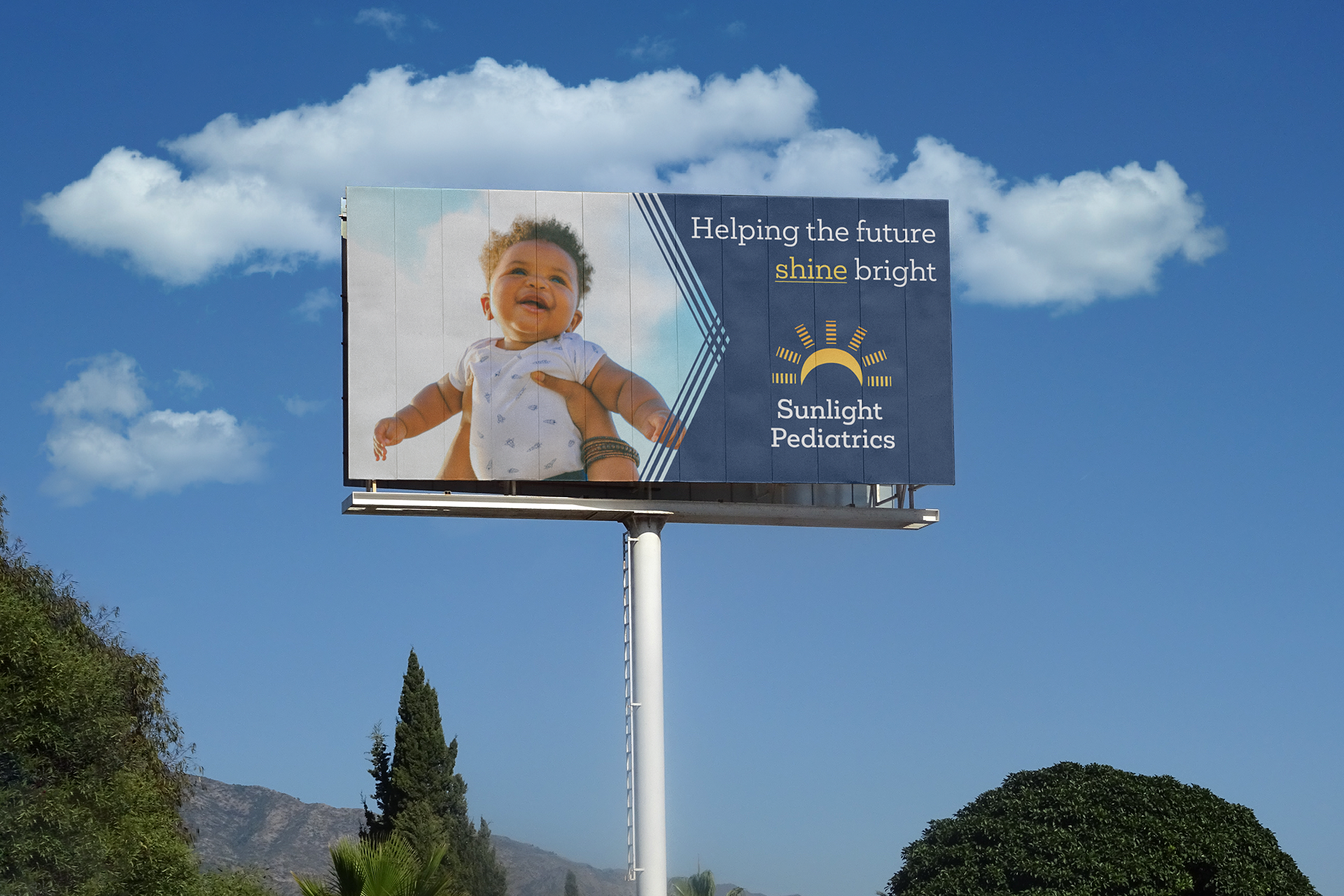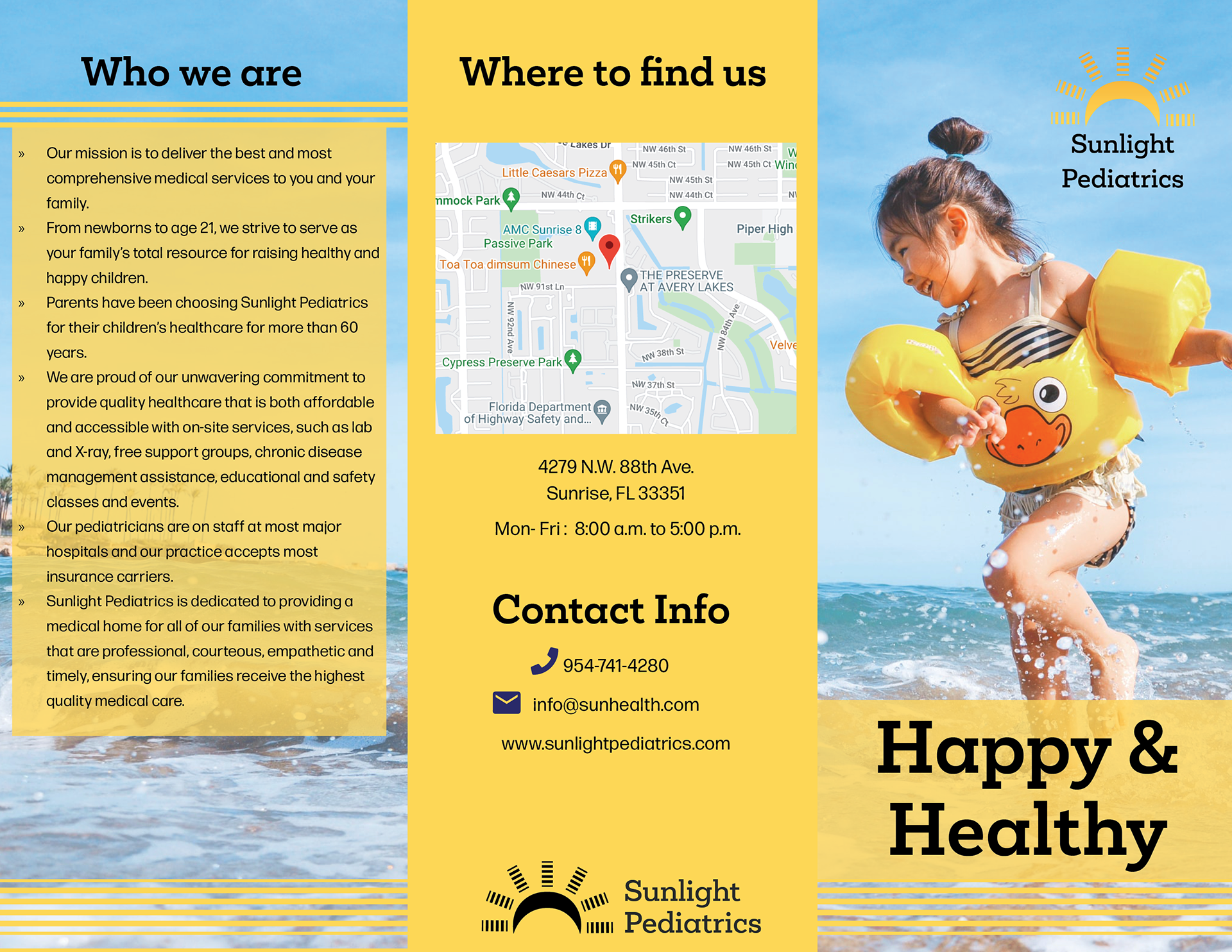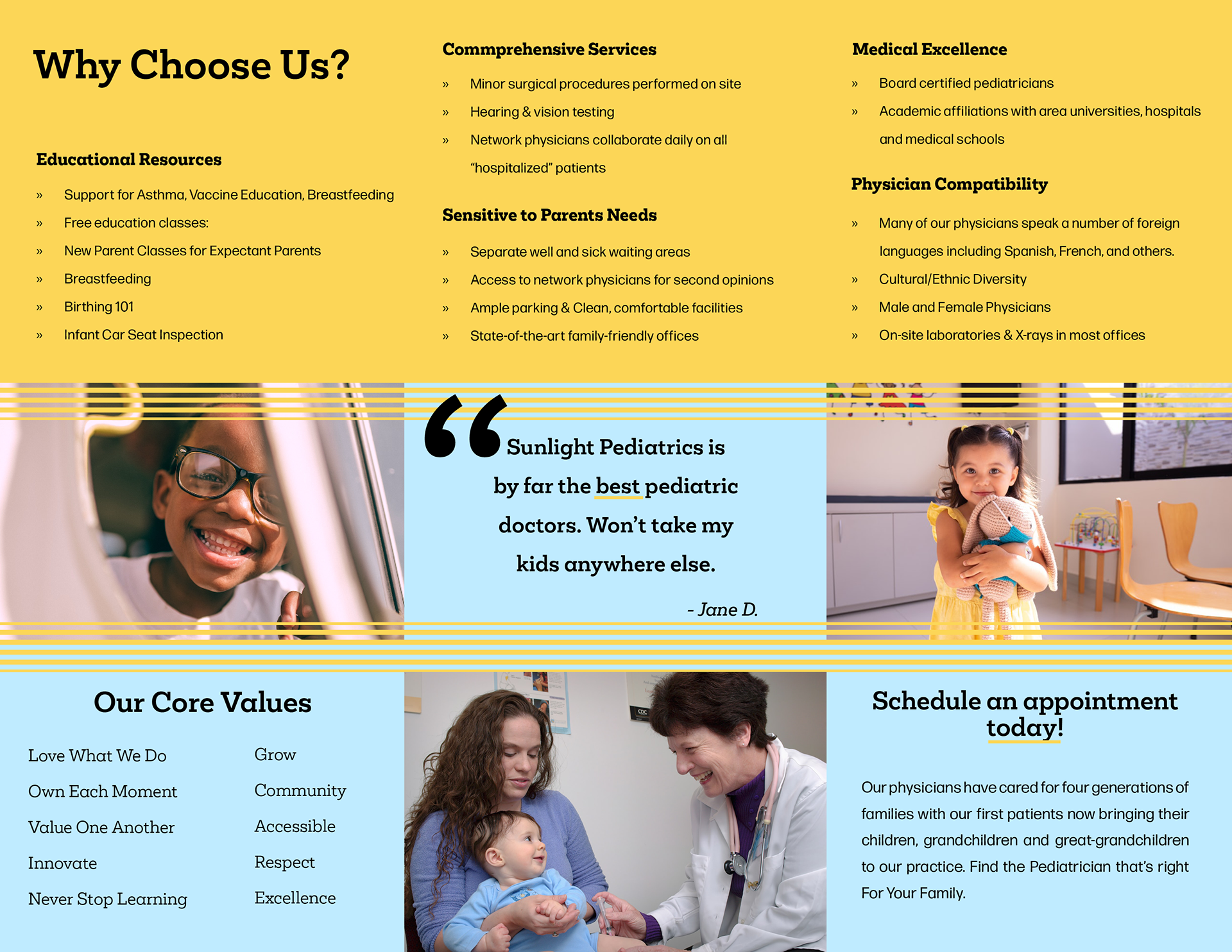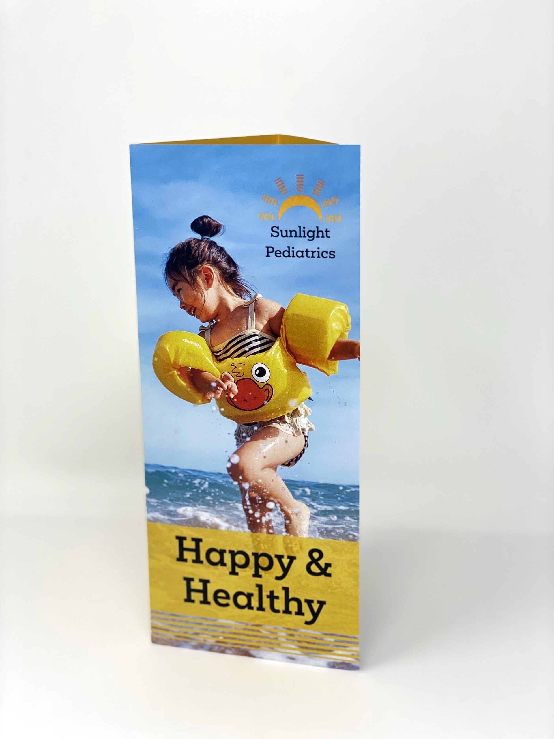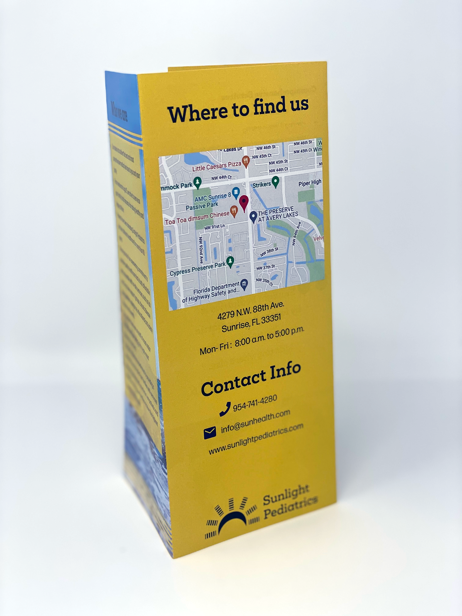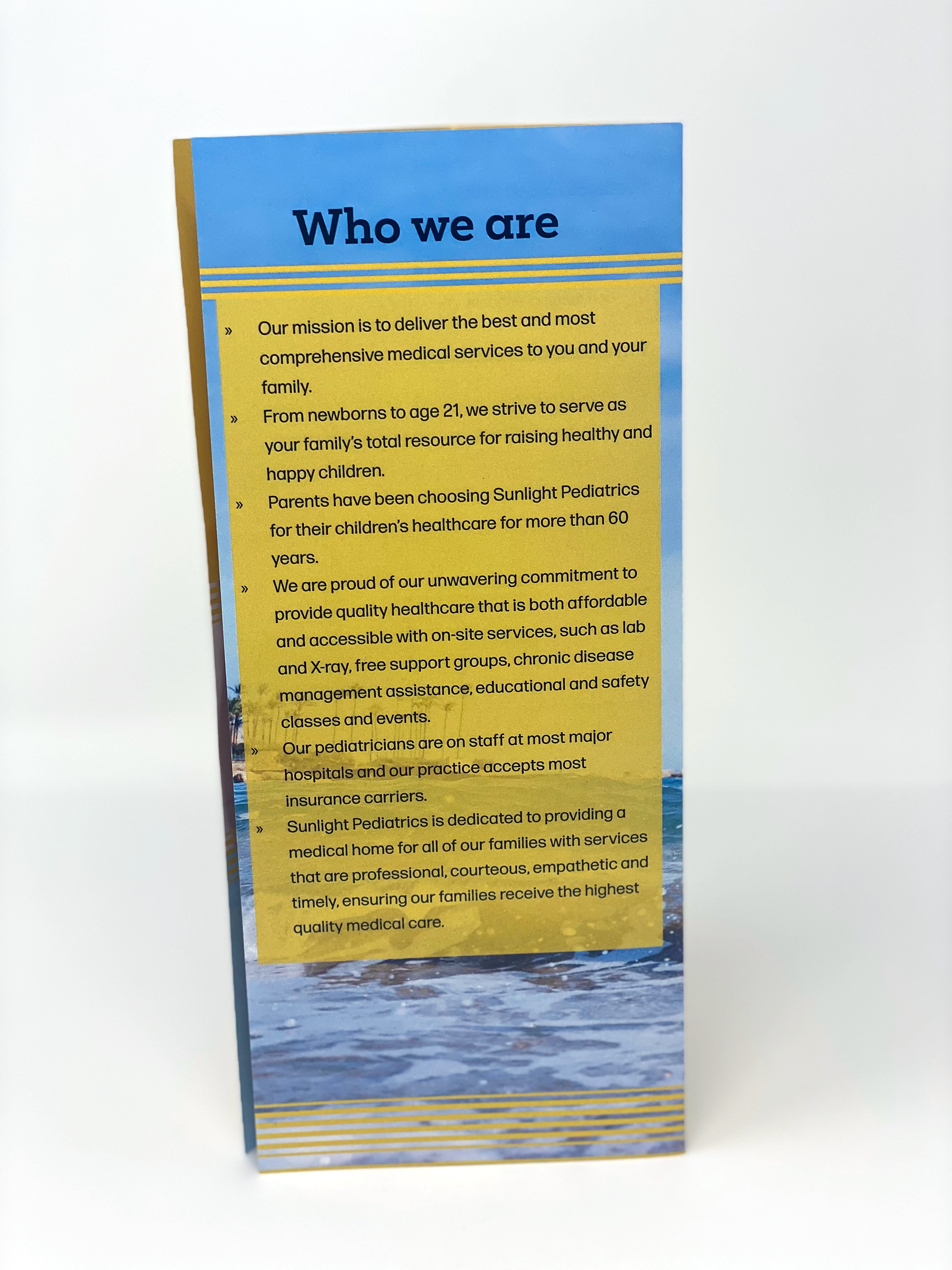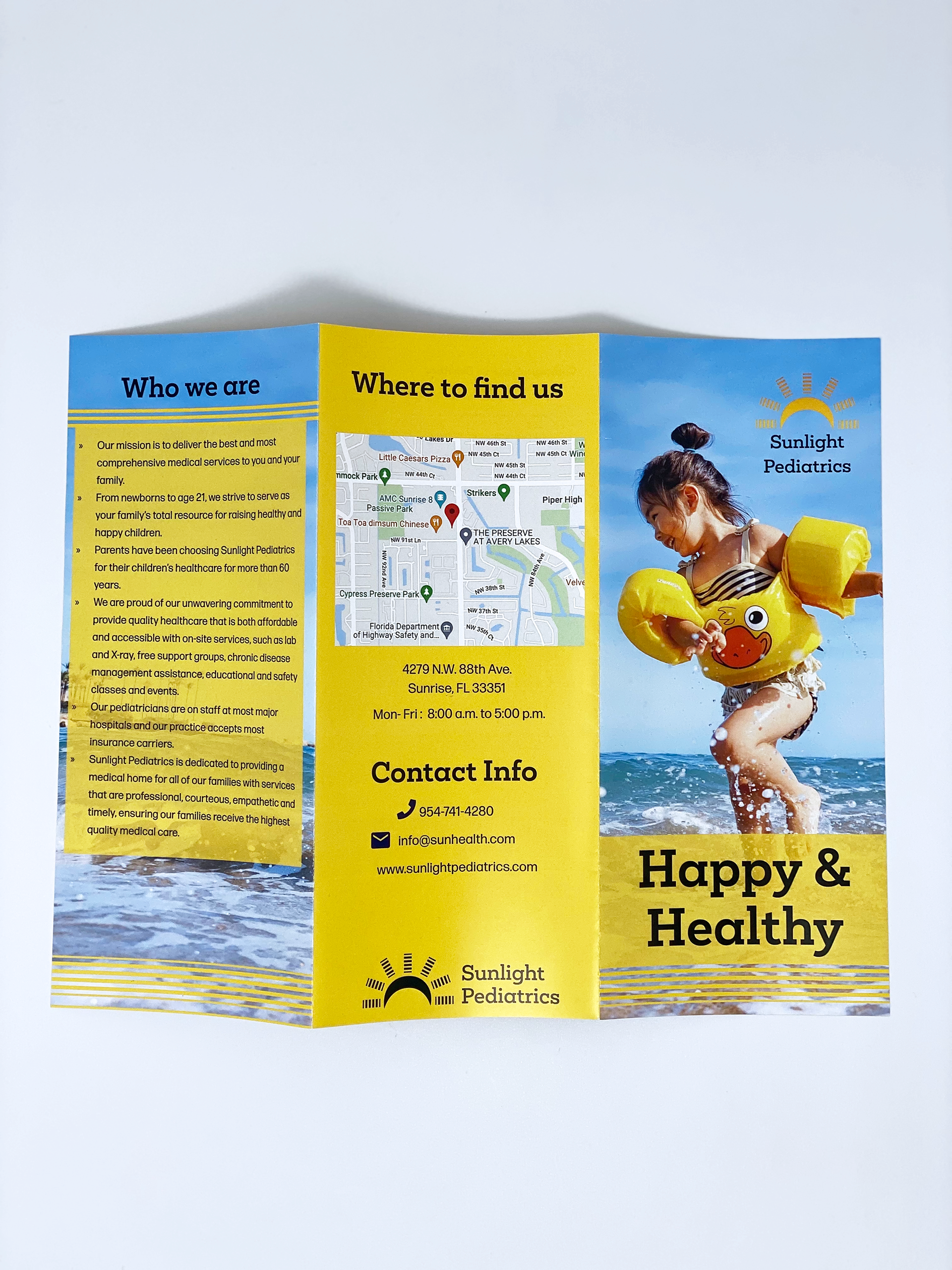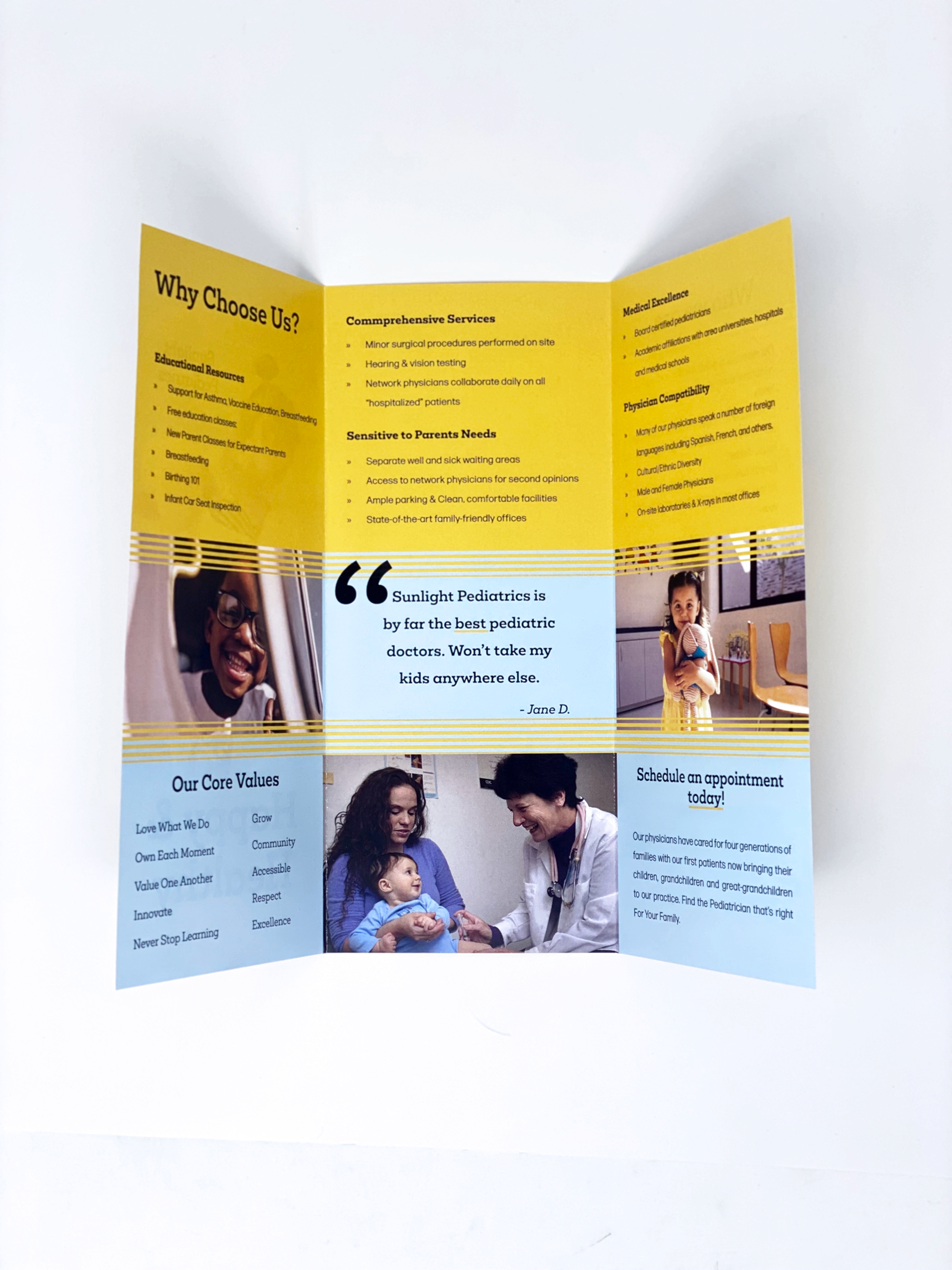
Sunlight Pediatrics priority is to keep children happy and healthy. The demographic is parents and children. Children are the light of the world and I wanted to show that through the logo. I used yellows and blues for this because it is bright aesthetic and it is child friendly, but I also aimed for a professional look. I wanted to stray away from the typical sun designs like triangles and organic lines. The tone is professional yet playful. I used the sun rays in my logo as the main pattern/element in my design to keep it consistent throughout. I emphasize specific words in my assets as a form of visual hierarchy and to gain attention of the viewer.